Mobile traffic/e-commerce is here to stay. Three to five years ago
mobile e-commerce was a small blip on analytics screens. Back then
analysts predicted the trend to grow, and early adapters jumped the gun
and either went for a dedicated mobile solution (in addition to their
main site,) or a mobile app. Responsive design was really not part of
the every day conversation among online retailers or web designers.
Fast forward to 2015 and - depending on whose statistics you read - between 15 - 50% of traffic to e-commerce sites come from mobile devices. Look at your Google Analytics and check out the "Mobile" menu option. You'll see what percentage of your traffic now comes from mobile. You can also see how much revenue or conversion you get from mobile. (If you don't have that info it means that e-commerce tracking is not set up in your Google Analytics. Contact www.monitus.net; they offer such a solution with a bunch more bells and whistles for Yahoo Stores.) I bet you will see an ever increasing number under mobile traffic.

Some of you may say, well, if someone really wants to buy the things from my site, they will do it no matter what. This may be true, but as mobile traffic increases, so is mobile search traffic. In fact, in November of 2014, Google announced that they will start to give preferential treatment to mobile-ready sites in their mobile search results. Such sites may come up before non-mobile friendly sites, and mobile friendly sites now have a "mobile-friendly" tag under their listing. To see if your site passes Google's criteria, put it through this link:
https://www.google.com/webmasters/tools/mobile-friendly/
Ok, so let's say you are convinced that you need to do something about the mobile-friendliness of your site. What are the options?
1) You can go with a dedicated mobile solution such as the one offered by Unbound Commerce. Here you get a separate site that "talks" to your regular site to get category and product info, but the site itself is a totally separate entity. When your main site is accessed from a mobile phone, traffic is redirected to your mobile site. Since the mobile version is very much streamlined to mobile traffic, it is extremely fast, but may also lack functionality that's available on your main site. You also pay a monthly fee for the service - along with a one time setup fee.
2) Some stores want to invest in a mobile app. A few things about this: for one, having a mobile app will not help you in the eyes of Google, since your actual site will still not be mobile friendly. Developing a mobile app can also be very costly. And finally, unless you are Amazon or eBay (are you?) who will want to install your store's app on their mobile phone?
3) If you operate a Yahoo! Store, you can invest in having your site redesigned to be responsive. What is responsive design? It is a way to make your site look and feel right on smaller devices such as tablets and mobile phones. It is done via a combination of what are called "media queries", css, and javascript tricks. Typically your "main" site will still look the same as before, but under the hood, things go to work when the site is pulled up on a mobile device, and the look of the menu, category thumbnails, product pages, etc., get altered on the fly so that the shopper doesn't have to scroll sideways or zoom, and can easily tap, swipe, or use other finger movements to easily navigate the site. Since your responsive site is the same site as your main site, there is no risk of duplicity (no duplicated content.) A drawback is that for each page you are still loading your regular store pages with everything in it (images, css, javascript, etc) so unless your site is optimally built this may mean slower rendering on slower mobile connections.
4) Adaptive design: this method works on the server level. The server detects if the visitor is on a tablet, or cell phone, or some other device, and it serves up a completely different version of the site, one that's hopefully optimized to that particular device. Yahoo! Stores, Yahoo! brand new e-commerce platform offers this approach. Since each version of the site is (supposed to be) optimized for the particular device it is viewed on, adaptive sites can be very fast. On the negative side though, you will basically have to maintain different versions of your web site for every device you are targeting (mobile, tablet, desktop, etc.) A minor point here: you may have read or heard that new Yahoo! Stores sites are automatically responsive. This is not entirely true: if you pick one of the existing templates that come with the platform, those are adaptive (not responsive). But if you want to have a custom designed, unique look and feel to your store, that design has to be done so that it is adaptive and/or responsive. There is no such thing as a free lunch!
Fast forward to 2015 and - depending on whose statistics you read - between 15 - 50% of traffic to e-commerce sites come from mobile devices. Look at your Google Analytics and check out the "Mobile" menu option. You'll see what percentage of your traffic now comes from mobile. You can also see how much revenue or conversion you get from mobile. (If you don't have that info it means that e-commerce tracking is not set up in your Google Analytics. Contact www.monitus.net; they offer such a solution with a bunch more bells and whistles for Yahoo Stores.) I bet you will see an ever increasing number under mobile traffic.

Some of you may say, well, if someone really wants to buy the things from my site, they will do it no matter what. This may be true, but as mobile traffic increases, so is mobile search traffic. In fact, in November of 2014, Google announced that they will start to give preferential treatment to mobile-ready sites in their mobile search results. Such sites may come up before non-mobile friendly sites, and mobile friendly sites now have a "mobile-friendly" tag under their listing. To see if your site passes Google's criteria, put it through this link:
https://www.google.com/webmasters/tools/mobile-friendly/
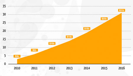 |
| Source: Statista |
Ok, so let's say you are convinced that you need to do something about the mobile-friendliness of your site. What are the options?
1) You can go with a dedicated mobile solution such as the one offered by Unbound Commerce. Here you get a separate site that "talks" to your regular site to get category and product info, but the site itself is a totally separate entity. When your main site is accessed from a mobile phone, traffic is redirected to your mobile site. Since the mobile version is very much streamlined to mobile traffic, it is extremely fast, but may also lack functionality that's available on your main site. You also pay a monthly fee for the service - along with a one time setup fee.
2) Some stores want to invest in a mobile app. A few things about this: for one, having a mobile app will not help you in the eyes of Google, since your actual site will still not be mobile friendly. Developing a mobile app can also be very costly. And finally, unless you are Amazon or eBay (are you?) who will want to install your store's app on their mobile phone?
3) If you operate a Yahoo! Store, you can invest in having your site redesigned to be responsive. What is responsive design? It is a way to make your site look and feel right on smaller devices such as tablets and mobile phones. It is done via a combination of what are called "media queries", css, and javascript tricks. Typically your "main" site will still look the same as before, but under the hood, things go to work when the site is pulled up on a mobile device, and the look of the menu, category thumbnails, product pages, etc., get altered on the fly so that the shopper doesn't have to scroll sideways or zoom, and can easily tap, swipe, or use other finger movements to easily navigate the site. Since your responsive site is the same site as your main site, there is no risk of duplicity (no duplicated content.) A drawback is that for each page you are still loading your regular store pages with everything in it (images, css, javascript, etc) so unless your site is optimally built this may mean slower rendering on slower mobile connections.
4) Adaptive design: this method works on the server level. The server detects if the visitor is on a tablet, or cell phone, or some other device, and it serves up a completely different version of the site, one that's hopefully optimized to that particular device. Yahoo! Stores, Yahoo! brand new e-commerce platform offers this approach. Since each version of the site is (supposed to be) optimized for the particular device it is viewed on, adaptive sites can be very fast. On the negative side though, you will basically have to maintain different versions of your web site for every device you are targeting (mobile, tablet, desktop, etc.) A minor point here: you may have read or heard that new Yahoo! Stores sites are automatically responsive. This is not entirely true: if you pick one of the existing templates that come with the platform, those are adaptive (not responsive). But if you want to have a custom designed, unique look and feel to your store, that design has to be done so that it is adaptive and/or responsive. There is no such thing as a free lunch!
Comments